Interpreting Categorical and Quantitative Data
This lesson discusses how to represent and interpret data for a dot plot, a histogram, and a box plot. It compares multiple sets of data by using the measures of center and spread and examines the impact of outliers.
Representing Data on a Number Line
There are two types of data: quantitative and categorical. Quantitative variables are numerical, such as number of people in a household, bank account balance, and number of cars sold. Categorical variables are not numerical, and there is no inherent way to order them. Examples are classes in college, types of pets, and party affiliations. The information for these data sets can be arranged on a number line using dot plots, histograms, and box plots.
A dot plot is a display of data using dots. The dots represent the number of times an item appears. Here is a sample of a dot plot.

The mean and median can be determined by looking at a dot plot. The mean is the sum of all items divided by the number of dots. The median is the middle dot or the average of the middle two dots.
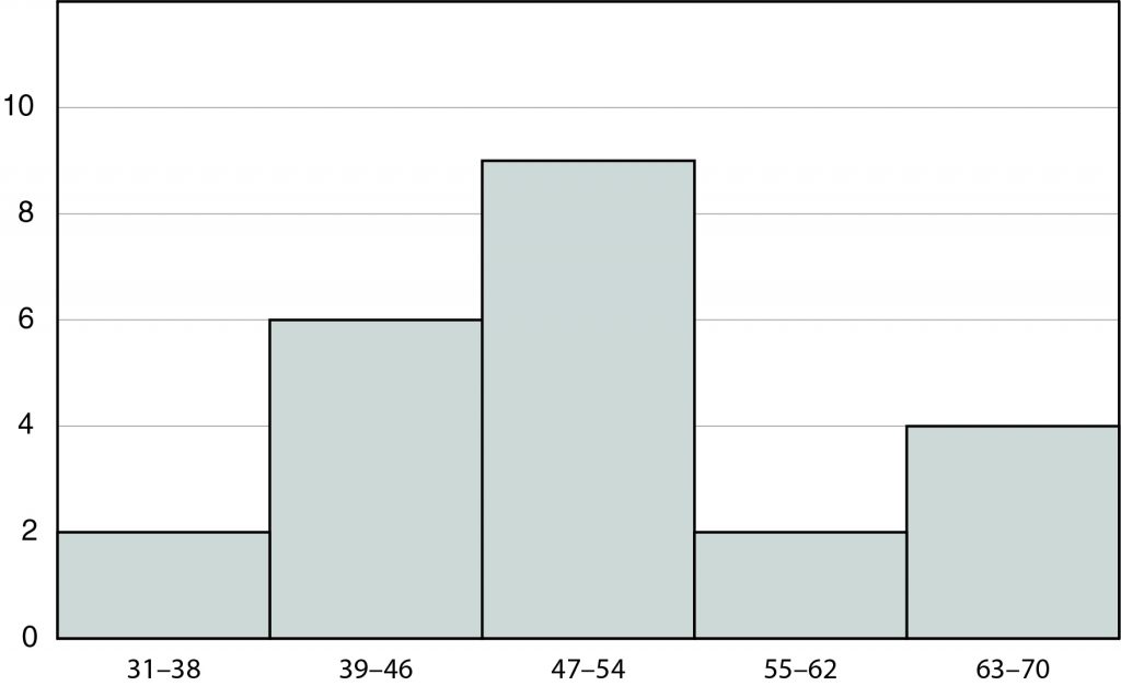
A histogram is a graphical display that has bars of various heights. It is similar to a bar chart, but the numbers are grouped into ranges. The bins, or ranges of values, of a histogram have equal lengths, such as 10 or 50 units. Continuous data such as weight, height, and amount of time are examples of data shown in a histogram. In the histogram to the right, the bin length is 8 units.

It is not possible to calculate the mean and median by looking at a histogram because there is a bin size rather than a single value on the horizontal axis. Histograms are beneficial when working with a large set of data.

BE CAREFUL!
Make sure to carefully interpret the data for any graphical display.
A box plot (or box-and-whisker plot) is a graphical display of the minimum, first quartile, median, third quartile, and maximum of a set of data. Recall the minimum is the smallest value and the maximum is the largest value in a set of data. The median is the middle number when the data set is written in order. The first quartile is the middle number between the minimum and the median. The third quartile is the middle number between the median and the maximum.
In the data display below, the minimum is 45, the first quartile is 50, the median is 57, the third quartile is 63, and the maximum is 75. With most box-and-whisker plots, the data is not symmetrical.

Example
Representing Data on a Number Line Review
Comparing Center and Spread of Multiple Data Sets
Standard Deviation
The measures of center are the mean (average) and median (middle number when written in order). These values describe the expected value of a data set. Very large or very small numbers affect the mean, but they do not affect the median.
The measures of spread are standard deviation (how far the numbers of a data set are from the mean) and interquartile range (the difference between the third and first quartile values).
To find the standard deviation:
- Find the mean.
- Find the difference between the mean and each member of the date set and square that result.
- Find the mean of the squared differences from the previous step.
- Apply the square root.
The larger the value for the standard deviation, the greater the spread of values from the mean. The larger the value for the interquartile range, the greater the spread of the middle 50% of values from the median.
Symmetric data has values that are close together, and the mean, median, and mode occur near the same value. The mean and standard deviation are used to explain multiple data sets and are evident in dot plots.
For example, consider this data set.
10, 10, 11, 11, 11, 12, 12, 12, 12, 12, 13, 13, 13, 14, 14
The mean is found by finding the sum of the numbers in the data set and dividing it by the number of items in the set, as follows:
10 + 10 + 11 + 11 + 11 + 12 + 12 + 12 + 12 + 12 + 13 + 13 + 13 + 14 + 14 = 180 ÷ 15 = 12.
The standard deviation calculation is shown in the table below.
| \(\textbf{Data}\) | \(\textbf{Data-Mean}\) | \(\textbf{(Data – Mean)^2}\) |
|---|---|---|
| 10 | -2 | 4 |
| 10 | -2 | 4 |
| 11 | -1 | 1 |
| 11 | -1 | 1 |
| 11 | -1 | 1 |
| 12 | 0 | 0 |
| 12 | 0 | 0 |
| 12 | 0 | 0 |
| 12 | 0 | 0 |
| 12 | 0 | 0 |
| 13 | 1 | 1 |
| 13 | 1 | 1 |
| 13 | 1 | 1 |
| 14 | 2 | 4 |
| 14 | 2 | 4 |
The sum of the last column is 22. The standard deviation is \(\sqrt{\frac{22}{15}}\) ≈ 1.211.
Next, consider this data set.
8, 8, 9, 10, 11, 12, 12, 12, 12, 12, 13, 14, 15, 16, 16
The mean is 8 + 8 + 9 + 10 + 11 + 12 + 12 + 12 + 12 + 12 + 13 + 14 + 15 + 16 + 16 = 180 ÷ 15 = 12.
The standard deviation calculation is shown in the table below.
| \(\textbf{Data}\) | \(\textbf{Data-Mean}\) | \(\textbf{(Data – Mean)^2}\) |
| 8 | -4 | 16 |
| 8 | -4 | 16 |
| 9 | -3 | 9 |
| 10 | -2 | 4 |
| 11 | -1 | 1 |
| 12 | 0 | 0 |
| 12 | 0 | 0 |
| 12 | 0 | 0 |
| 12 | 0 | 0 |
| 12 | 0 | 0 |
| 13 | 1 | 1 |
| 14 | 2 | 4 |
| 15 | 3 | 9 |
| 16 | 4 | 16 |
| 16 | 4 | 16 |
The sum of the last column is 92. The standard deviation is \(\sqrt{\frac{92}{15}}\) ≈ 2.476.
Therefore, the second set of data has values that are farther from the mean than the first data set.
Comparing Spread Review
Dot and Box Plots
When data is skewed, a group of its values are close and the remaining values are evenly spread. The median and interquartile range are used to explain multiple data sets and are evident in dot plots and box plots.
The data set 10, 10, 11, 11, 11, 11, 11, 11, 12, 12, 12, 13, 13, 14, 15 has a median of 11 and an interquartile range of 2. The data set 10, 11, 12, 12, 13, 13, 14, 14, 14, 14, 14, 14, 14, 15, 15 has a median of 14 and an interquartile range of 2. The median is greater in the second data set, but the spread of data is the same for both sets of data.

KEEP IN MIND
Compare the same measure of center or variation to draw accurate conclusions when comparing data sets.
Example
Comparing Spread with Box Plots Review
Determining the Effect of Extreme Data Points
An outlier is a value that is much smaller or much larger than rest of the values in a data set. This value has an impact on the mean and standard deviation values and occasionally has an impact on the median and interquartile range values.
The data set of 10, 10, 11, 11, 11, 12, 12, 12, 12, 12, 13, 13, 13, 14, 14 has a mean of 12 and a standard deviation of 1.211. If an outlier of 50 is added, the data set has a mean of has a mean of 14.38 and a standard deviation of 9.273. The outlier has increased the mean by more than 2, and the spread of the data has increased significantly.
The data set 10, 10, 11, 11, 11, 11, 11, 11, 12, 12, 12, 13, 13, 14, 15 has a median of 11 and an interquartile range of 2. If an outlier of 50 is added, the median slightly increases to 11.5 and the interquartile range remains 2.

BE CAREFUL!
There may be a high outlier and a low outlier that may not have an impact on data.
Example
Determining the Effect on Extreme Data Points Review
Let’s Review!
- Dot plots, histograms, and box plots summarize and represent data on a number line.
- The mean and standard deviation are used to compare symmetric data sets.
- The median and interquartile range are used to compare skewed data sets.
- Outliers can impact measures of center and spread, particularly mean and standard deviation.
Subscribe to the online course to gain access to the full lesson content.
If your not ready for a subscription yet, be sure to check out our free practice tests and sample lesson at this link


